Introducing Content Hub
In light of Cornerstone’s flourishing content business and its continuous growth, the need arose for a captivating public gallery to showcase its extensive range of content offerings. This gallery would play a vital role in supporting sales and content marketing efforts, acting as a valuable tool when engaging with potential clients. In addition, the content business sought an elegant platform that could effectively present their various subscription options, highlight individual offerings, and proudly promote their original content, which had garnered numerous awards.
In the midst of nearing the final stages of product release, Cornerstone presented us with a significant hurdle due to a major rebranding effort. The renowned design firm Pentagram spearheaded the rebranding, but the new guidelines deviated so significantly from our previous framework that we had to reevaluate user journeys for approximately 50% of the Content Hub. Despite the magnitude of the challenge, it was a career highlight for me to provide UI consulting to the world famous Pentagram during this transformative process.
Problem statement
The pending product launch requires a comprehensive redesign of all elements to align with new branding and interaction guidelines.
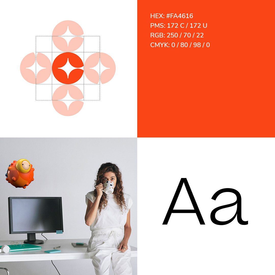
The thrill of the rebrand
We had to quickly come up with a plan to adapt the previous uncontained, flat, and sharp aesthetics to an existing information structure that embraced containment, gradients, and rounded corners.
Component system for the win
To deal with the time crunch, I suggested using an existing component library to speed up the process. The idea was a hit with the various teams, and we decided to base our new component library on Chakra. We designed a flexible set of components inspired by the typical information structures found in CSOD web pages. To help the developers grasp how different sections worked together, I created a few template pages. This allowed us to quickly prototype and approve modules, giving the developers a head start on building them before finalizing the layout of the templated pages.
By working in this manner, we were able to meet our demanding deadlines without overwhelming our development team.


research insights
Cleaning up details
We were fortunate to gather data on the Content Hub through an internal soft launch exclusively accessible to our customers. This allowed us to obtain valuable heat map data indicating user clicks and scroll behavior. Amongst many items, We discovered that users were not engaging with our videos, likely because the video button was not prominent enough. Additionally, we observed a high click rate on H1 page titles despite them not being links, which prompted us to incorporate more visible call-to-action buttons and non-colored headings.




Fun details
Original pages for original content


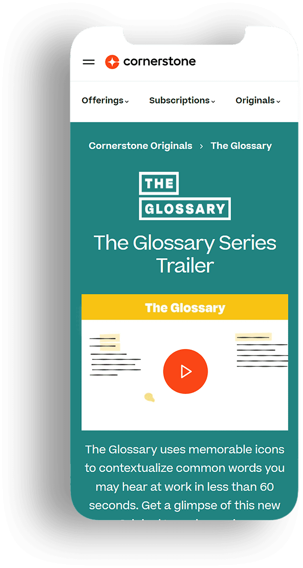
Given that all our original content possesses distinctive branding akin to shows on Netflix, we granted them unique pages that resonated with their individual identities. To maintain visual coherence and prevent overwhelming chaos, we strategically identified specific sections where their unique visual assets could take center stage while ensuring the remaining parts of the page adhered to the overarching cornerstone branding. This resulted in each series boasting its own exclusive header graphics, complemented by a corresponding video playlist component.
Thank you
