Cornerstone
Companion
Evolving generative AI at Cornerstone

Table of Contents
background
The journey of evolving Gen AI design at Cornerstone began with Companion AI, our first foray into generative AI launched in July 2023. This project was more than just an introduction to AI; it was a catalyst for a complete design overhaul across our platform. From addressing specific challenges in content creation to developing a robust, adaptable design system, we navigated uncharted territory to redefine how AI could enhance user experience.
Starting with raw concepts and limited examples, we quickly learned what worked and what didn’t. We developed a new set of design principles and interactive patterns that ensured consistency and usability across multiple products, each with unique requirements. These efforts laid the groundwork for our native, enabled, and assistive AI experiences, all while aligning with Cornerstone’s evolving needs.
Through iterative testing, refining user interactions, and setting clear standards, we turned initial successes and challenges into a comprehensive design evolution that has set the stage for future innovations. Companion AI wasn’t just a product—it was the foundation for a new era of design thinking and technological integration at Cornerstone.
A new era of design
Lessons from our first Gen AI integration
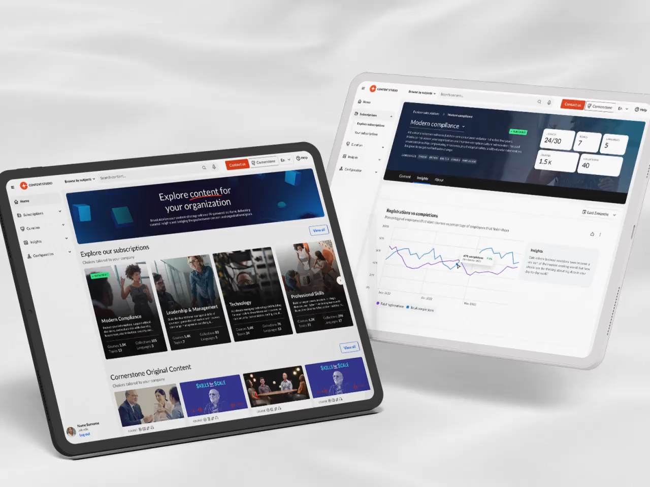
Cornerstone’s first leap into the Gen AI product space happened in July 2023. The buzz around generative AI was electric, but we also had some serious pain points in Content Studio that could be tackled with an AI assistant. Curators were struggling to come up with catchy names for learning playlists and to write engaging descriptions. Plus, while Content Studio made finding relevant content easier, curators still spent hours deciding between courses that covered similar topics. Bringing in an AI assistant to lighten this load felt like a no-brainer.
The initial designs that made it into our MVP were cutting-edge for the time, but looking back, they definitely show their age compared to what we know now in AI UX/UI. Back then, we didn’t have a lot of examples to learn from, which meant we had to wing it in many ways. We made sure the AI features were super obvious because users weren’t familiar with AI interactions yet—or even the classic star icon, for that matter.
Despite this, the product release was a big hit with our users and served as a launchpad, propelling me to lead the direction of all AI design at Cornerstone. The lessons learned from building this initial version laid the groundwork for a robust design system with strict user patterns and guidelines that the rest of Cornerstone could follow.

Winner for best Gen AI
Craig weiss Group
Analyzing our approach
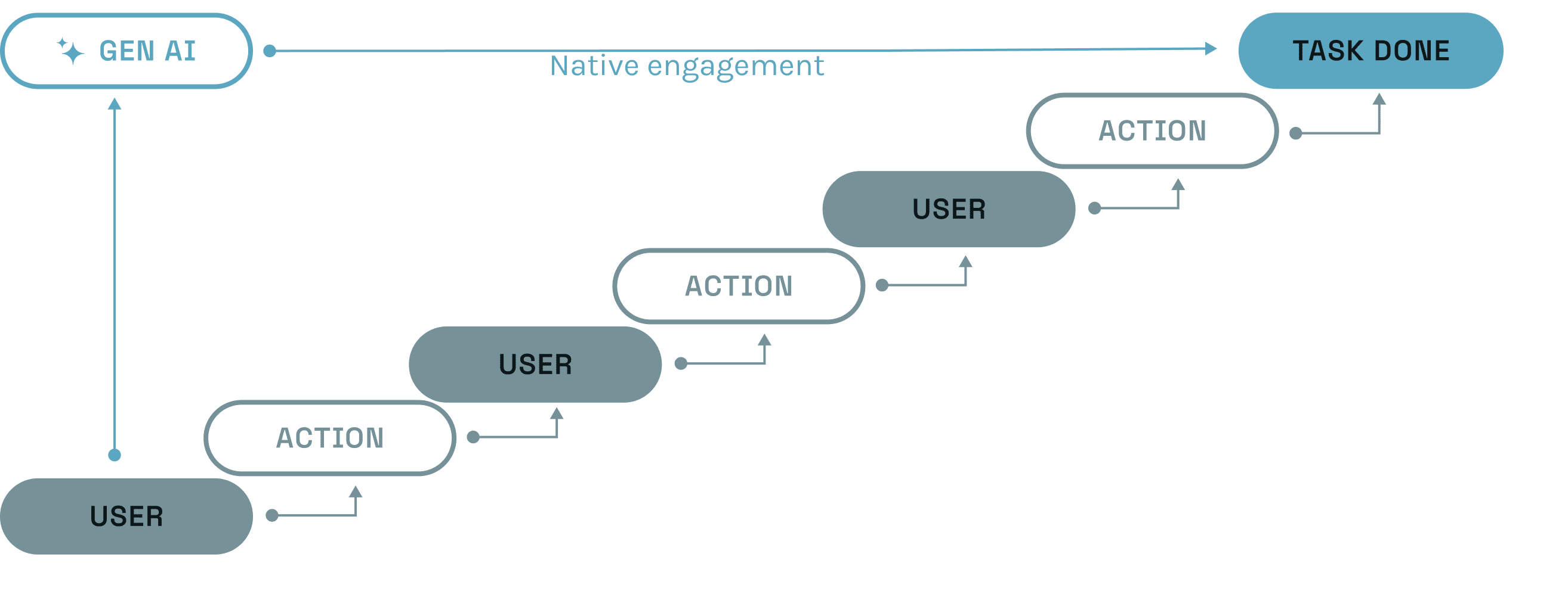
After cataloging all our requests, it became clear that they fell into two categories:
1. Native Engagement: An AI-led experience where AI takes a central role in all actions throughout the user journey.
2. Contextual Engagement: An AI action designed to assist with an existing product flow without taking center stage.Defining AI product types
Recognizing our two approaches to AI, we defined two categories to encapsulate projects within these frameworks. This was crucial because the UI and design systems would vary depending on how AI was applied. While the first two categories are officially recognized by Cornerstone, I coined a third category, “assistive,” which doesn’t quite fit into either of the others and requires its own unique set of rules and guidelines.
Enabled AI applies to interactions with contextual engagement. These are often quick actions that appear when a user is completing a familiar task within a product. They are integrated into existing products, with the UI designed to align with the product's existing design system.
Native AI applies to products with native engagement, where AI takes center stage and manages most, if not all, tasks a user needs to perform. Native AI has the flexibility to introduce a new design focused on AI tasks, as it operates independently of existing products and their design guidelines.
Assistive AI combines elements of both approaches. It operates within existing products but utilizes features from Native AI, adding an intelligent layer or modal that sits atop the product. It's similar to how Siri functions within Apple products.
Establishing interactive patterns
To ensure consistency across our enabled projects, despite their presence in multiple products and design systems, we established a set of strict interactive patterns. These design guidelines were essential because many designers were tempted to use the new UI elements we were developing for native AI in contexts where they didn’t fit. We needed to ensure that all experiences adhered to the design standards of their respective systems while introducing new functionality and maintaining overall consistency.
We began with a very simple flow for generating text inside input fields and slowly expanded that to a large library of library of user engagement patterns. Progress was slow because we had to ensure that our user patterns could be freely replicated inside the restrictions of all our products. The guideline flows are semantic as they have to freely adapt to the UI of their existing products.


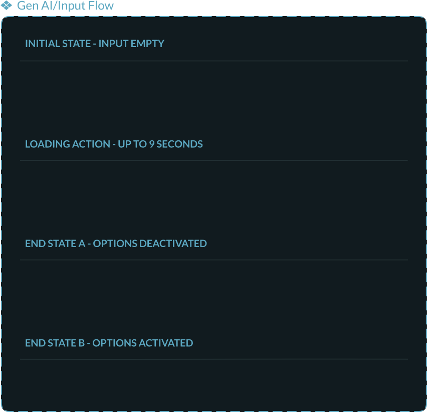
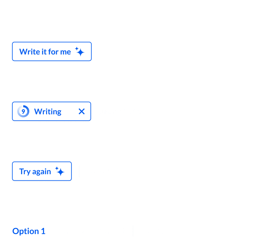
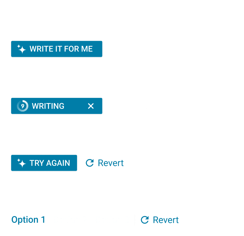
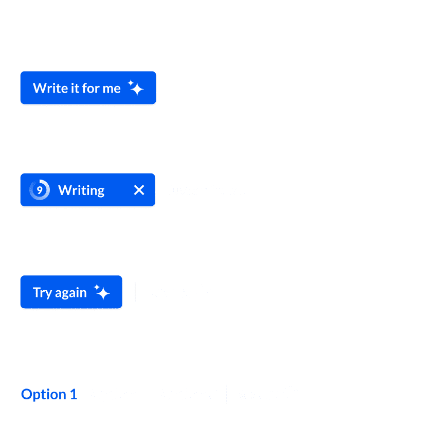
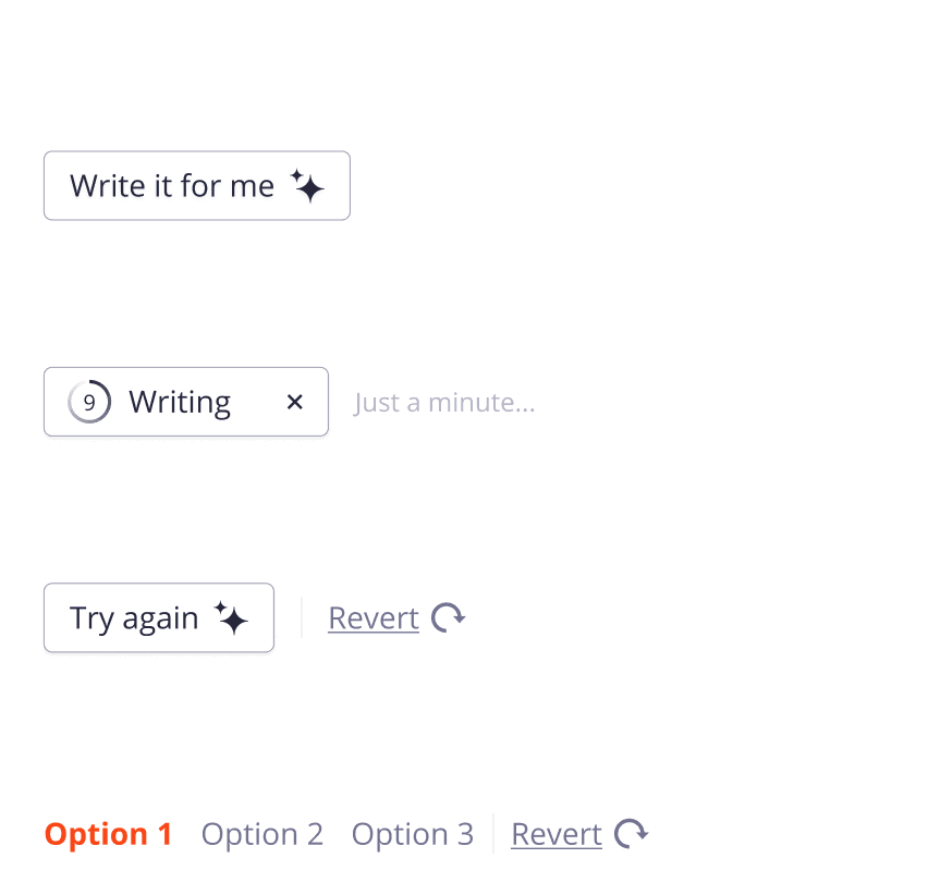
Variable control for:
design systempreloader timebutton typesdecision pathsbrandingerror forks
We developed a system where entire flows were encapsulated within single components, allowing designers to easily integrate them into their designs without needing to manage the details of specific patterns. These flow components came with adjustable variables that designers could toggle to fit particular UX patterns (e.g., output options), design systems, or technical requirements (e.g., server call time).
These componentized flows were supported by a set of prototypes corresponding to design patterns that had become standard. If new product requests had requirements outside our existing guidelines, we would take ownership of them to incorporate their rulesets into our system.
Bringing all CSOD products into alignment
Gen AI interactions were kept consistent across all products thanks to the strict guidelines we enforced. This was a significant achievement, especially considering the diverse technical requirements stemming from Cornerstone’s numerous acquisitions over the years. Because AI was a new addition, it was able to bypass many of the standardization challenges that had complicated other Cornerstone initiatives—a primary reason for the multiple design systems in use.
- Cornerstone SBX
- Edcast
- Content Studio
Cornerstone Companion timeline
Below is a timeline of projects that significantly influenced the design direction of Gen AI at Cornerstone.
Content Studio Curation
Universal Course Player
Embedded Design System
Companion Insights
Cornerstone SBX
Course Builder
Native Experience
Establishing our design principals
I created this list of design principals after I noticed that nearly every product manager was requesting a chat-led experience, even when it wasn’t suitable for the task at hand. It seems many people equate Gen AI with chat, leading to a natural inclination to follow the hype and push for its inclusion.
This list of departmental principles quickly evolved to address a wide range of common obstacles we repeatedly encountered during the planning phases of new features. This list has become a pilar of our design department and is featured on our website.

Leverage the power of AI to solve unmet user needs
Leverage the power of AI to solve unmet user needs

Only use chat interfaces when it makes sense
Only use chat interfaces when it makes sense

Quick actions and contextual menus are the way forward
Quick actions and contextual menus are the way forward

Dead-end user paths must be avoided at all costs
Dead-end user paths must be avoided at all costs

"Prompt engineering" has no place in any product
"Prompt engineering" has no place in any product

Be clear and forward with legal agreement pages
Be clear and forward with legal agreement pages

AI-based actions should be easy to comprehend
AI-based actions should be easy to comprehend

Abide by stringent accessibility standards
Abide by stringent accessibility standards

A focused product is the desired approach
A focused product is the desired approach

Branding and badging must be distinct from AI action icons
branding and badging must be distinct from AI action icons

Visual simplicity is the goal but removing customization is not
Visual simplicity is the goal but removing customization is not

Always allow users to undo an AI action or request
Always allow users to undo an AI action or request
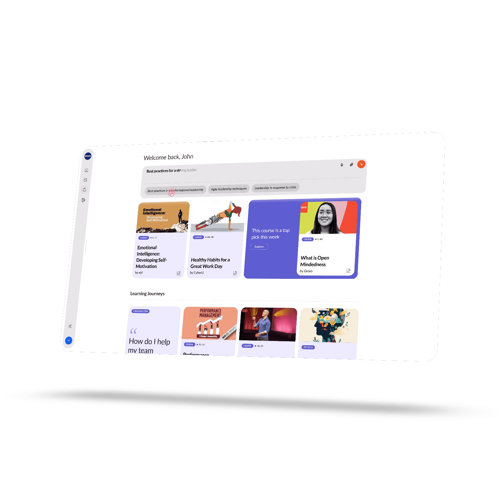
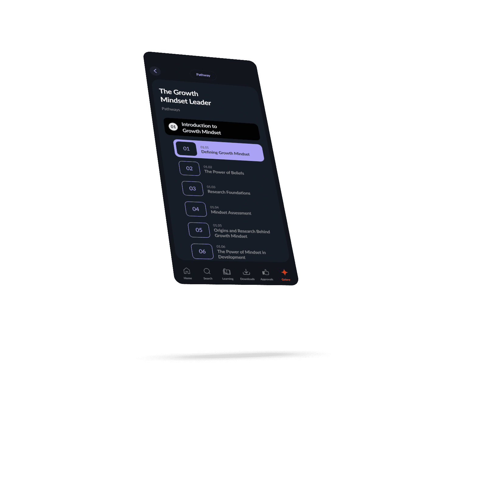
The native experience was originally designed by Raw Materials for the Cornerstone Connect Live Conference in 2024 under my creative direction. It took center stage at the event, captivating our customer audience by showcasing how AI would soon be available to learners on our platforms. The demonstration, entirely in dark mode, marked a significant departure from Cornerstone’s traditional white aesthetic, serving as a perfect metaphor for the organization’s embrace of a modern approach to emerging technology.
Initially, the product suffered from scope creep, with unrelated features being added by various stakeholders at Cornerstone. However, it was later refined into a focused experience that performed exceptionally well in user testing sessions, often leaving users wanting more. The product began as an AI-led version of our CSX experience for admins, learners, and curators, but evolved into a more streamlined, learning-focused discovery and consumption experience.
Building a foundation
From a challenging start
The Native Experience had an interesting start, as we faced the challenge of balancing input from a large group of stakeholders, each with their own set of requirements. Adding to the excitement, we had just one month to bring it all together. A significant amount of effort went into crafting designs that felt like an exciting step forward while still resonating with our customer base, who preferred a more familiar, traditional software look.
While the initial product concept was somewhat unfocused, it had a strong foundation for user interactions within an AI-led environment. The lessons we learned during its design phase helped us refine our ideas into a laser-focused product.
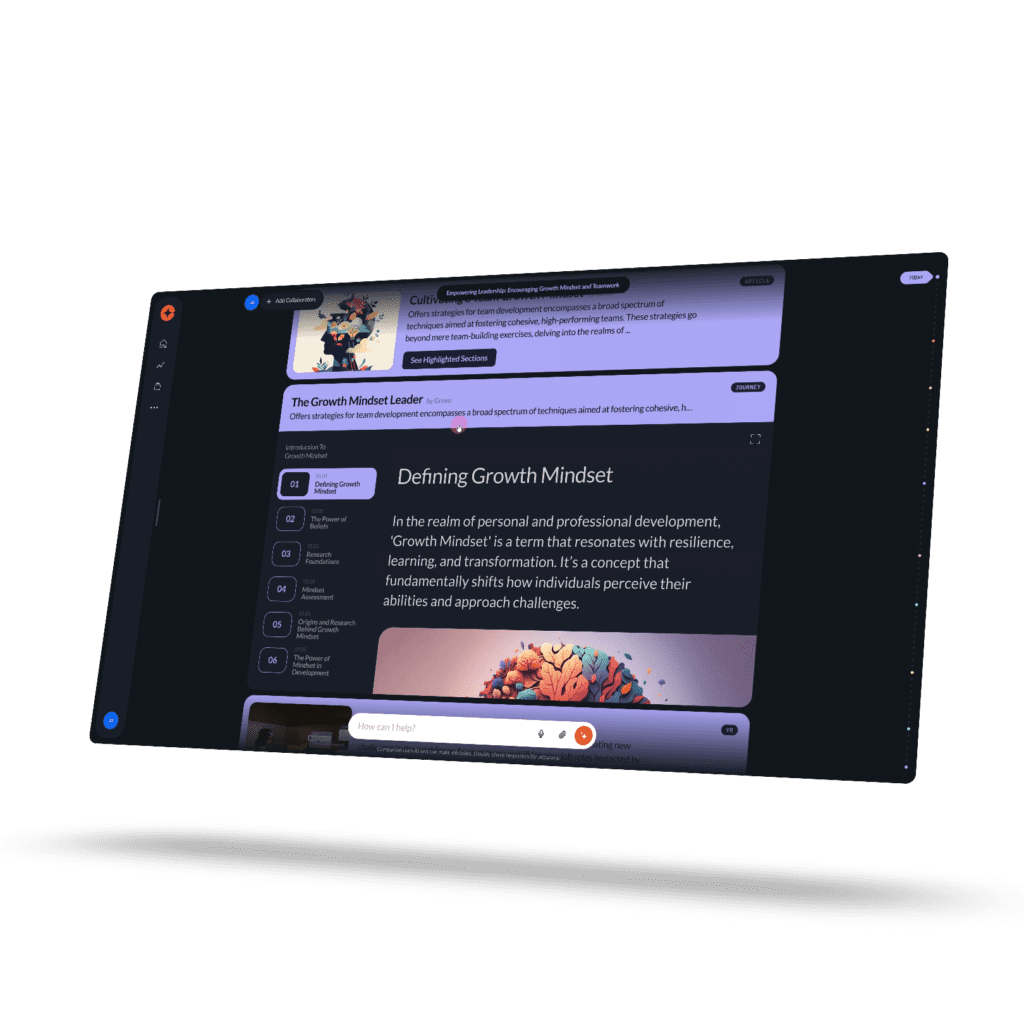
Connect Live
The crowd goes wild
After many late nights of feedback and revisions, we managed to meet the deadline to submit our project for Connect Live. To our delight, our presentation was a showstopper. It drew cheers from the audience, and at one point, the room gasped as we demonstrated our contextual menus. The enthusiastic reception made it clear we had a hit on our hands—it was now about refining our presentation into a polished product that elegantly addressed user pain points.
Audit Overhaul
The Native Experience underwent two extensive design audits following the Connect Live conference. The first audit phase focused on transforming the presentation into a functional MVP with a limited project scope that could be released in cycles. The second audit aimed to align the Native Experience more closely with Cornerstone’s other products. When a product has as much visibility within a corporation as this one did, comprehensive audits are an expected outcome. ullamcorper mattis, pulvinar dapibus leo.
Phase one: from presentation to mvp
My primary focus was refining what Raw Materials had started, turning it into a focused product to serve as an MVP. Most of my effort went into transforming the designs into a streamlined product centered on content discovery and consumption, leveraging insights from my work on Content Studio. I eliminated unnecessary features to create an optimal user journey for content discovery. About 90% of the original designs were reworked to support both light and dark modes.
Drawing on my experience with content, I redesigned content cards to display only essential metadata, emphasizing images and titles. I also reimagined text placement, user interactions, popup modals, media players, and the chat system to ensure they were functional while retaining the aesthetic appeal that excited the audience. Motion design was crucial in making the Native Experience feel as fluid as it looked. Additionally, I introduced numerous quality-of-life features.
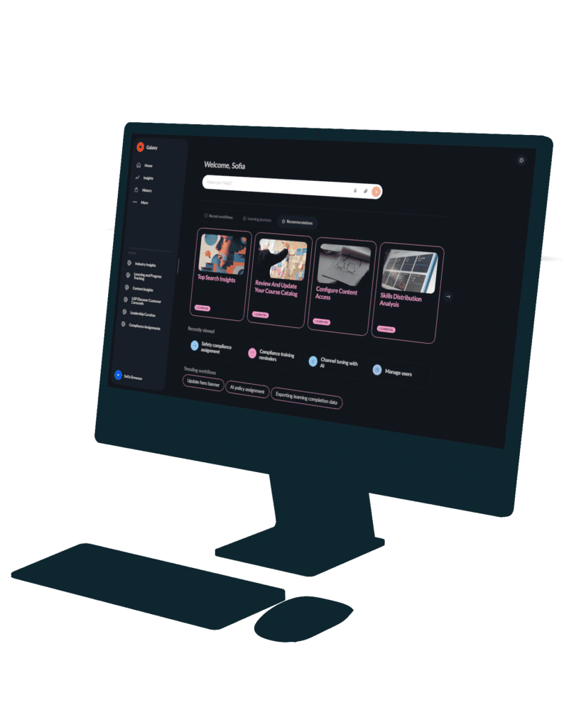
- Demo Shown at Conerstone Connect Live
- Rebuilt experience using Cornerstone's design tokens
- Final MVP Design
- Extensive design auditing to discover a middle ground
Phase two: Gen AI Snowflakes


This phase began when members of the design team raised concerns about the new design system causing further fragmentation, as we were working to align all products under the Flair design system. The designs underwent a thorough audit, where all components were adapted to existing Flair design tokens with subtle style adjustments. However, several components remained unchanged due to the lack of suitable counterparts in the Flair library. These unique elements were dubbed “Gen AI Snowflakes” because of their distinctiveness.
The changes from this audit significantly altered the product’s look and feel, causing frustration among the technology and product teams, who felt the modifications diminished the product’s unique appeal. User testing results strongly favored the designs from the first audit, reinforcing the argument to revert to those original concepts. Consequently, we decided to retain the distinct identity established in the first audit and develop a library of Native-specific design tokens within the Flair component library.
Crafting a forward-looking design framework
Introducing variables and semantic tokens
The native design system was built from the ground up around semantic design tokens, leveraging Figma’s variable linkage. It was the first design system at Cornerstone to adopt this forward-thinking approach, not only by creating semantic tokens but also by extensively using variable linkage. I chose this direction because dark and light modes were requirements from the outset, and utilizing variables was the most effective way to manage these contrasting themes.
This strategic decision received significant praise from the technology teams, as they were beginning discussions about transitioning Flair to a similar system. As a result, I conducted instructional presentations for the core design systems team to help them implement a comparable approach.
Why was animating this text with JavaScript faster than doing it in Figma?

Overcoming limitations
Building an animation engine inside Figma
After some user testing, it became clear that animated text was essential for users to recognize the prototype as a conversational experience. The issue is, Figma isn’t built to handle these kinds of animations. While plugins are available to speed up the process, they all share a major flaw: you can’t easily edit the text once it’s been animated. I hoped some of the creative agencies I collaborated with had a more efficient solution for animating text, but they were all using variations of the same cumbersome approach.
After wasting hours on minor copy tweaks, I decided to pivot and build my own animation engine to solve these problems. My goal was to create an engine that allowed designers to easily edit text while also being simple to integrate with other animations. To add complexity, it couldn’t rely on variables since it needed to be part of the Companion component library, and linking variables with external documents is a buggy ordeal. I mostly achieved this, and the design team has benefited from significantly faster prototype creation.
thank you
