Developing an Identity:
CyberU Platform
CyberU operates as an internal division within Cornerstone, adopting a startup-oriented approach. Its primary objective is to curate video e-learning content for dissemination through Cornerstone’s galaxy LMS. I was recruited from the entertainment industry to oversee a comprehensive redesign of its visual identity and the enhancement of its various products, tools, and services. Given the startup nature of the environment, I assumed responsibility for all creative assets required by the company in addition to new product development.
When I arrived, both the band and the product were distinctly amateurish. There was no cohesive design approach, and everything lacked the professional polish you’d expect from an established company. Guided by the singular task to imbue the company with an aura of “coolness, modernity, and freshness,” I initiated an extensive endeavor to reconfigure every facet, encompassing band guidelines, UI interfaces, websites, presentation templates, marketing collateral, and promotional videos.
Auditing the landscape
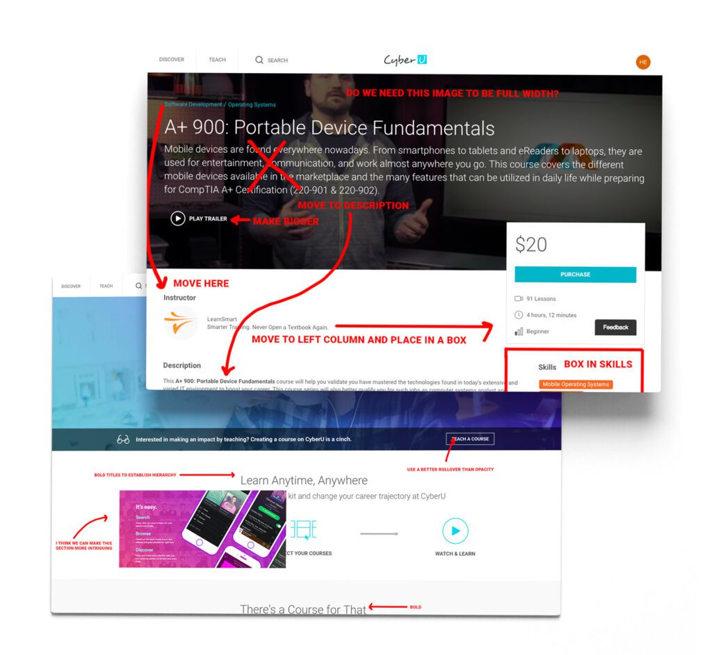
I conducted an extensive design audit of CyberU’s product interfaces, websites, and marketing collateral. I meticulously documented opportunities for refining the visual impact of each element while also enhancing usability.A significant portion of my time was dedicated to creating mood boards that juxtaposed our current state with our desired outcome. Ultimately, the decision was made to retain the vibrant and spirited CyberU logo and color scheme, while undertaking a comprehensive overhaul of all other aspects.
Establishing a roadmap
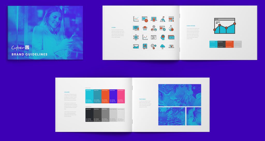
Prior to implementing substantial modifications to the products, my objective was to establish a cohesive central theme. To accomplish this, I meticulously developed a comprehensive 50-page branding guideline. It encompasses an extensive range of elements, encompassing gradients, gradient maps, textures, icon design, stock photography, as well as customary components like logo usage and typography. This living document was continuously updated to incorporate additional items that necessitated design guidance.
In parallel with the development of the branding document, I began defining a component library. This involved the adaptation of the branding guidelines’ principles into a user interface framework. Particular emphasis was placed on harmonizing the fresh and vibrant colors within the UI, thereby establishing a consistent thematic approach while upholding utmost user-friendliness. The ultimate result comprised of two robust documents that would facilitate a seamless transition in reshaping CyberU’s image.
Redefining the UI
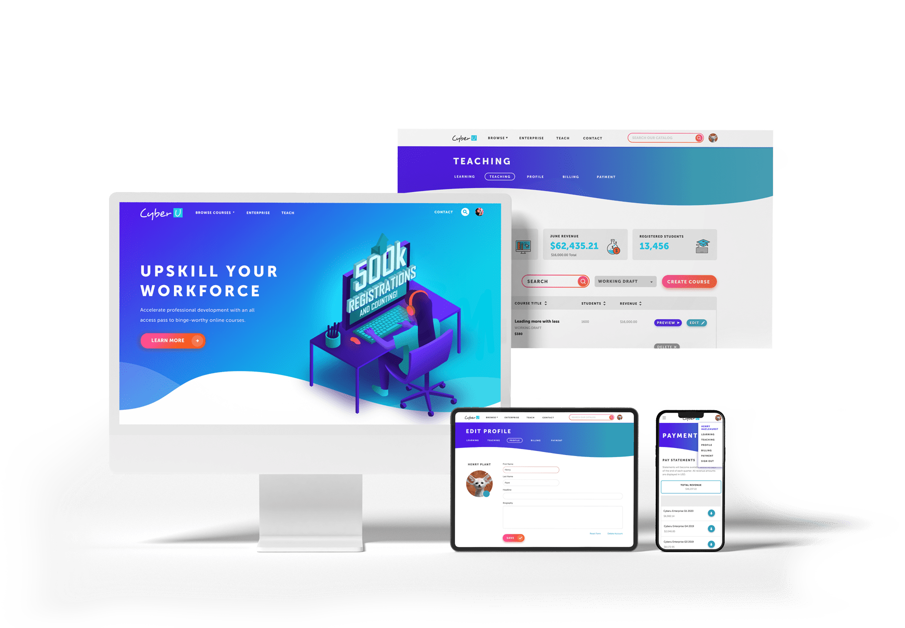
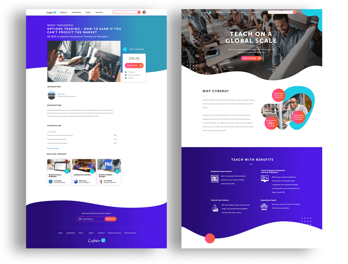
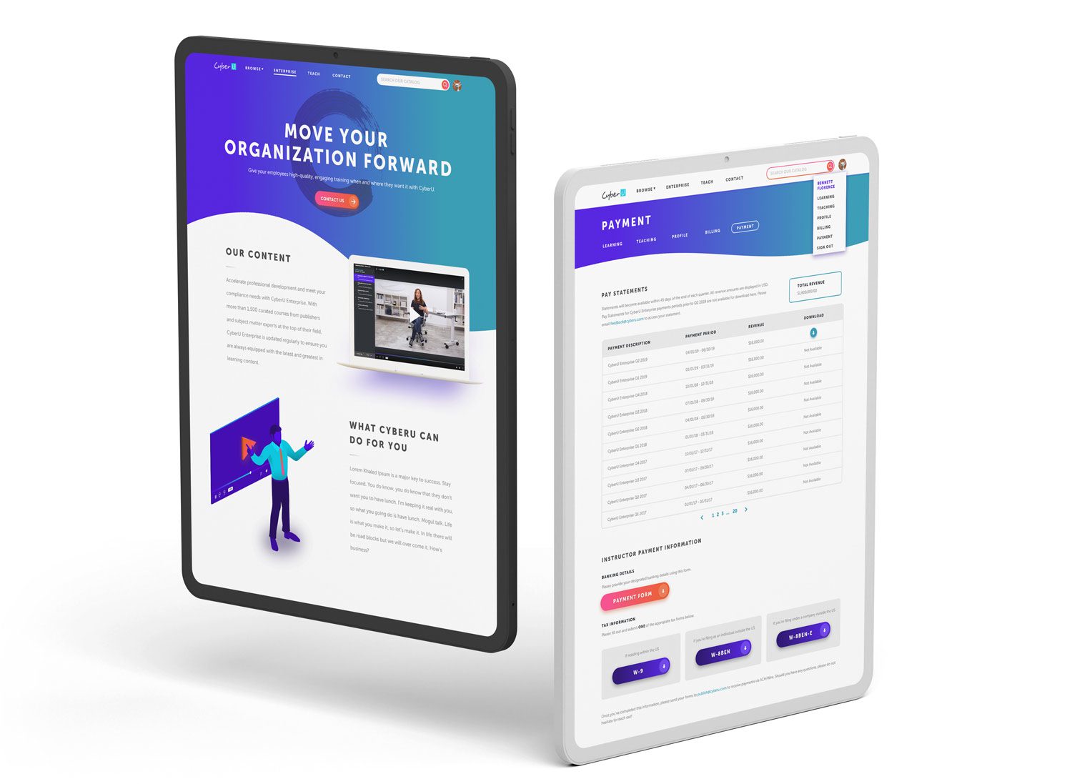
When I gave the UI a makeover, I really honed in on readability, visual hierarchy, and defining clear interaction points, all while giving everything a fun and fresh look. To make our website and apps stand out, I decided to use waves instead of the usual horizontal lines you see everywhere. The effect made the pages feel fluid these were often accompanied by other design elements to make the page construction feel less linear
The buttons, links, and calls-to-action were designed to be high contrast but not overly distracting, so users would notice the important areas. I also provided detailed notes for the developers, covering hover effects, modal window launches, page animations, and header bar transformations. And for an extra touch, I created some awesome isometric SVG images for the hero sections.


Trickling the design down to all parts
As is typical with a rebrand, I was the one responsible for reworking everything across the company. Thankfully, the wide range of items I had to redesign kept the task from becoming overwhelming or monotonous. From loading graphics to marketing materials, banner ads, promotional videos, illustrations, and merchandise, there was no shortage of things to readjust. Ultimately, I accomplished my aim to unify all the creative output emanating from CyberU.

Some background
Why does a product designer have a page dedicated to branding?
Besides highlighting my broader skills in creative direction, It completes the story behind the design and functionality of CyberU’s products. Branding was one of the most pivotal aspects in developing CyberU’s products. It was how we distinguished our offerings from competitors, who often had boring and clunky video interfaces. Branding was the building blocks from which our products drew massive success. Describing my time designing products for CyberU would be incomplete with out detailing about all of the branding efforts because every user journey and experience was intricately governed by the visual hierarchy I established at the beginning.
Thank you
